
Design Rationale
the logo
The round logo is an abstract map of Scandinavia. The positive space (colored areas) roughly represents the shape and placement of each country. I chose a map of the region because the membership has a wide range of research specializations, with the common factor being the geographic area they study.
The lines created by the negative space are organic and natural, reminiscent of Rosemaling. They evoke a Scandinavian connection to nature without feeling too folksy or decorative. The interplay of swirls in both positive and negative space symbolizes change and movement, reflecting the dynamic nature of research and study.
Additionally, the shapes formed within the design subtly reference abstract initials: an “S” appears in the diagonal line at the top (connecting “Greenland,” “Iceland,” and “Norway”), an “A” forms a triangular shape between “Iceland” and “Norway,” and two more “S” shapes emerge—one along the north coast of “Denmark” and another in the gulf between “Sweden” and “Finland.”
It’s important that the map remains abstract to ensure inclusivity. The logo is not intended to be a detailed cartographic representation, as capturing every island, bay, and coastline to everyone’s satisfaction would be impractical.
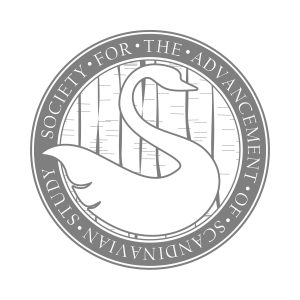
the seal
Because the seal is used less frequently than the logo, it allows for more intricate detail and the inclusion of specific symbolism.
SWAN
The swan emerged as a favored motif in the initial round of logo concepts. It is a fitting symbol for the SASS seal: native to Scandinavia, commonly associated with the region, widely recognizable, and, in heraldry, a traditional emblem of knowledge.
BIRCH BARK
Birch trees and their bark are recurring motifs in Scandinavian art, reflecting the region’s deep connection to nature. In heraldry, trees represent antiquity, strength, and knowledge.
TREES
Trees more broadly are symbolic of Scandinavian folklore and the region’s strong ties to the natural world. In heraldic tradition, trees signify antiquity, resilience, and knowledge.